4/6/25 (Completed on 3/8/25)
Explore the AutoSum functions with other data fields. How do these calculations impact or inform your understanding of the data? What questions do you have about the data or calculations?
– The AutoSum functions work as a very solid way to quickly find numerical trends, averages, etc. I think that in terms of impacting or informing my understanding of the data, it serves as a very solid way to gain a full view of the data, but maybe lacks the careful eye of pruning through data sets one-by-one to most holistically view data. I think that maybe doing Data Visualization in addition to AutoSum will provide a wider understanding of the rows and rows of numbers.
What types of visualizations were you able to generate in Excel using PivotChart? How could those visualizations shape or impact your understanding of the data? Did you generate any visualizations that were confusing or misleading? Alternatively, did you generate any visualizations that were unexpected or illuminating?
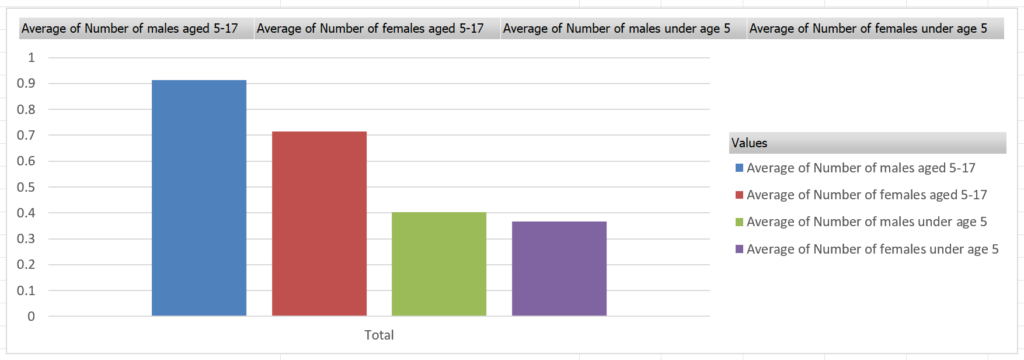
– Another visualization I generated was comparing the average amount of minors (children) in each household, and found that elder sons were most common and younger daughters were least common. These visualizations can help shape or impact understandings of the data as they can take pure numerical data and create visual, and easy to understand, comparisons. Rather than simply numerically analyzing the data, using visualizations, you can analyze specific comparisons–rather than seeing the average amount of males age 5-17, you can visually compare that number with others, creating a new quantifiable set of data to analyze.